Lizzian.

Work

Twelve mockups, twelve reasons a site was failing.

Each design below is paired with the problem it solves, what we would build, and the checks that decide whether it is finished.

How to read this page

The twelve projects below are composite examples, and the businesses in them are invented. The screens are design mockups we made to show the work — they are not screenshots of client sites, and nothing here is a case study of a named client. When we have completed work a client is happy to have named, it will appear on this page with their name on it, and not before.

Note what the pictures do not do: they do not carry the facts. Every claim about every project is written below its image as text, the same way we build. A page that needs its picture to be understood is a page a machine cannot read.

Composite examples

Twelve industries, twelve different failures.

Clinics, professional firms, hospitality, trades, food, retail, B2B. The industries differ; the underlying problem rarely does.

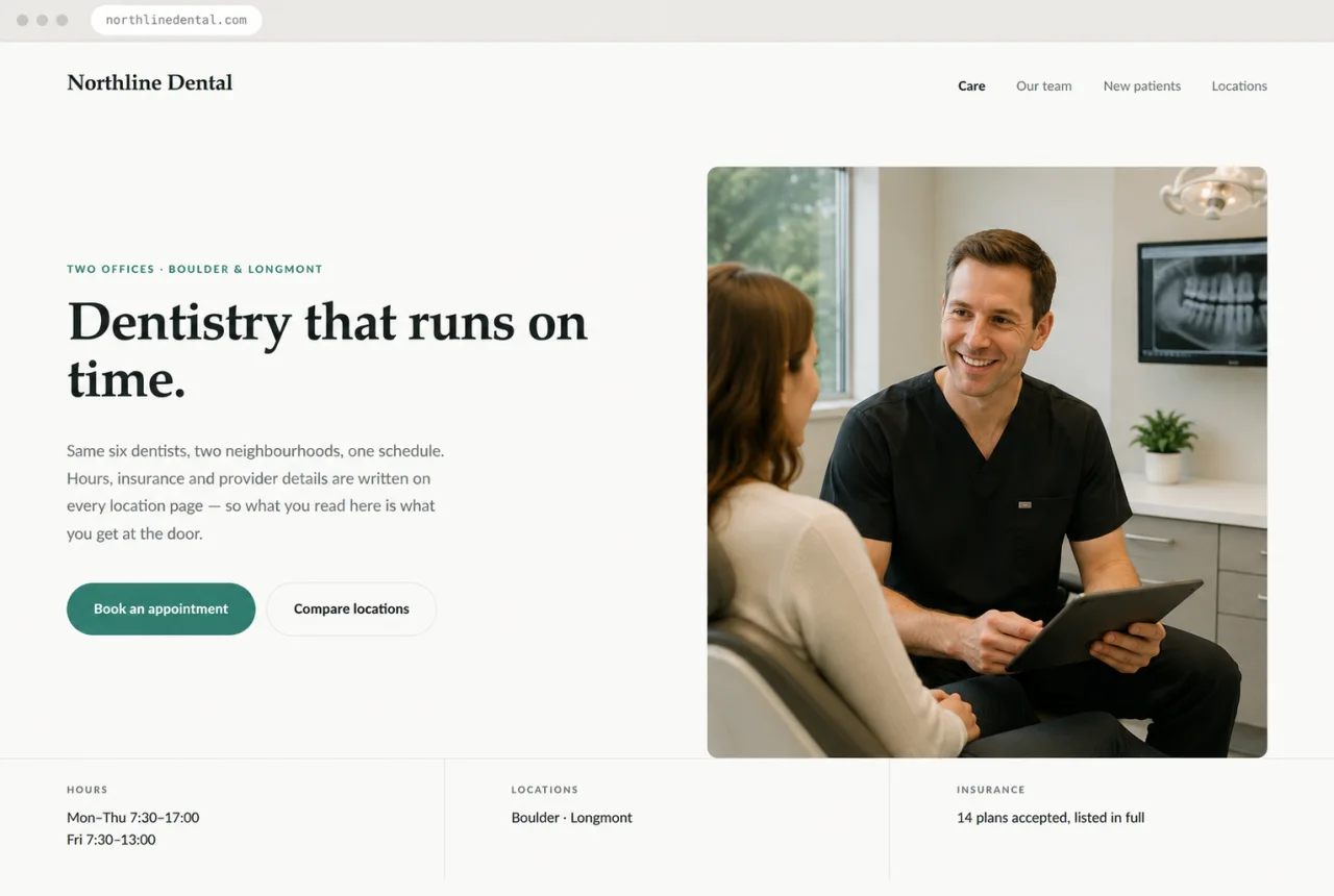
Design mockup of a dental practice website with a dentist consulting a patient, the headline “Dentistry that runs on time”, and visible opening hours, locations and insurance details.
Hypothetical · Dental practice · two locations

Three sets of hours, none of them right

Illustrative design mockup. Not a client site.

The situation. Six providers across two offices. Hours were published in a header graphic, again inside a third-party booking widget, and again on the map listing — all three different after a schedule change nobody propagated. Patients were arriving at a closed office.

What we built. One canonical fact set covering both offices, and a page per location generated from it: address, hours, parking, providers and accepted insurance, all as selectable text. Structured data emitted from the same fact set, so the markup cannot drift from the page. The booking widget embedded beneath the information rather than in place of it.

How we verified it. Hours identical in the page text, the structured data and the map listing. Each location has its own URL and address block. Every page renders completely with JavaScript disabled.
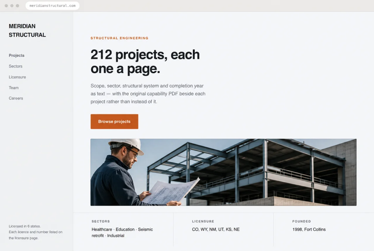
Design mockup of a structural engineering website with an engineer reviewing plans beside a steel structure, the headline “212 projects, each one a page”, and visible licensure details.
Hypothetical · Structural engineering firm

Twenty years of projects, invisible in HTML

Illustrative design mockup. Not a client site.

The situation. Two decades of completed work living entirely inside downloadable capability statements and project PDFs. The site itself was four pages of copy that could have described any engineering firm in the country, and no page said which states the firm was licensed in.

What we built. Project pages carrying scope, sector, location, structural system and completion year as text, with the original PDF offered beside each one rather than instead of it. A licensure page naming each jurisdiction and licence type. Team pages with credentials and the sectors each engineer leads.

How we verified it. Every jurisdiction, credential and project fact appears as text in the served HTML and was confirmed by the firm before publication. Structured data for the organisation and named staff matches the visible pages exactly.

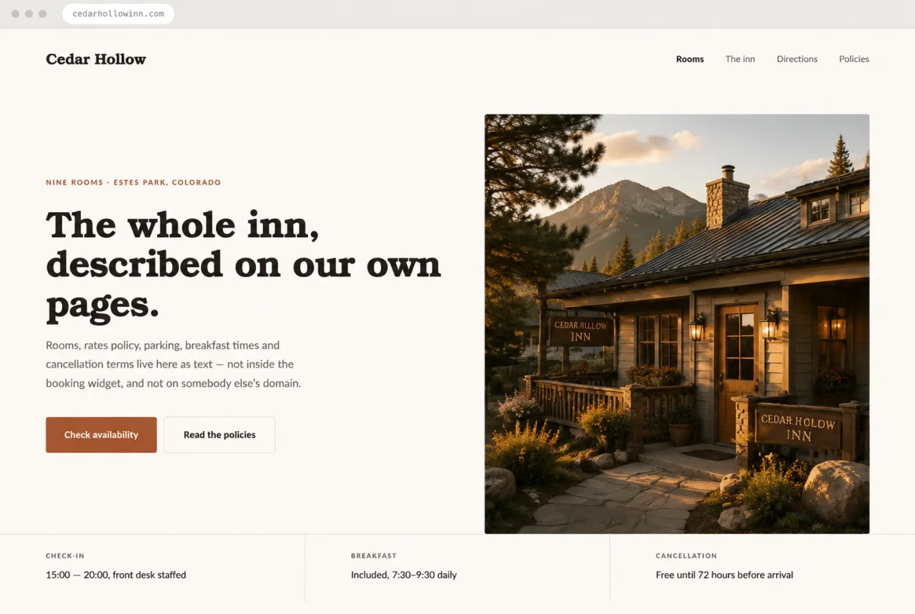
Design mockup of a country inn website with a Colorado mountain inn at golden hour, the headline “The whole inn, described on our own pages”, and visible check-in and cancellation details.
Hypothetical · Independent inn · nine rooms

A booking engine that swallowed the property

Illustrative design mockup. Not a client site.

The situation. The entire site was a JavaScript shell wrapped around a third-party booking engine. Room descriptions, photographs, the cancellation policy and even the street address lived on the vendor's domain. With scripts blocked, the inn's homepage was blank.

What we built. A static site on the inn's own domain carrying room types, rates policy, directions, parking, accessibility notes, house rules, breakfast times and check-in windows as readable text. Photography served from the inn's own hosting. The booking engine reached from a clear route, doing what it is good at.

How we verified it. Every policy and property fact is readable with JavaScript disabled. Footer address, structured data and map listing are identical. The site would still describe the inn correctly if the booking vendor disappeared tomorrow.

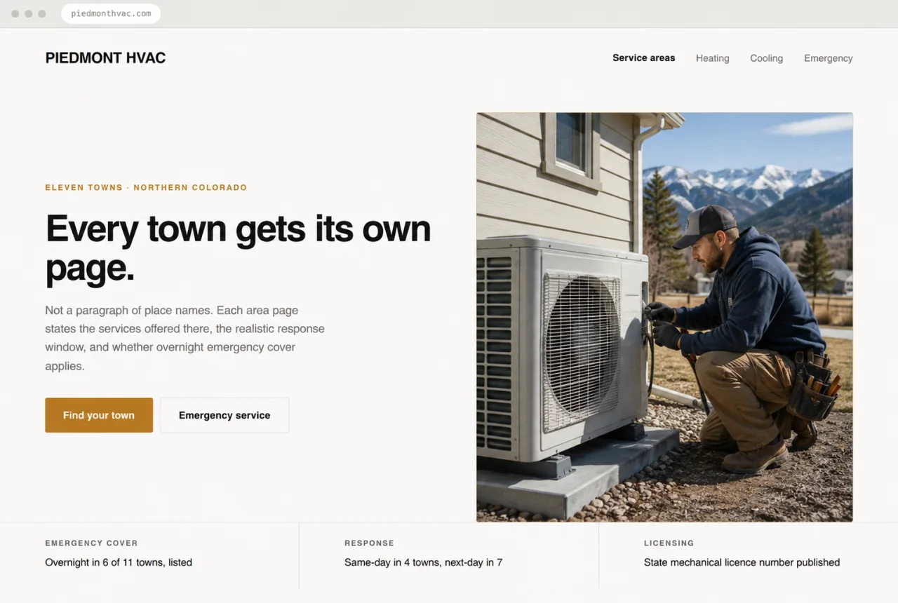
Design mockup of an HVAC contractor website with a technician servicing a heat pump, the headline “Every town gets its own page”, and visible emergency coverage and licensing details.
Hypothetical · HVAC contractor · eleven towns

Eleven towns, one page, no phone above the fold

Illustrative design mockup. Not a client site.

The situation. A single “Areas We Serve” page listing eleven towns inside one paragraph. The phone number appeared once, rendered inside a footer image, so a caller on a phone had to scroll the whole page and retype it by hand. Overnight emergency cover — the firm's main advantage — was mentioned nowhere.

What we built. A tappable phone link in the header on every page and screen size. Genuine per-area pages, written rather than spun, stating the services offered there, realistic response expectations and whether emergency cover applies. Service-area structured data matching the pages, with no towns claimed that the firm does not serve.

How we verified it. The number is a tappable link inside the first screen on a phone and identical everywhere it appears. Each area page contains distinct written content. Markup, pages and the owner's own list of towns all agree.

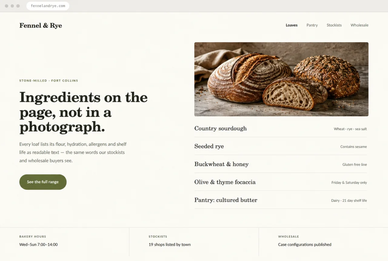
Design mockup of a bakery website with artisan sourdough loaves, the headline “Ingredients on the page, not in a photograph”, and a readable list of flours, allergens and stockists.
Hypothetical · Bakery and food producer

Allergens in three slightly different versions

Illustrative design mockup. Not a client site.

The situation. Product descriptions, ingredients, allergen statements and sourcing existed only inside marketplace listings and a social profile, in three versions that did not match. The bakery's own domain redirected to the social page, so retail buyers looking the company up found nothing to point anyone at.

What we built. An owned site with a page per product carrying ingredients, allergens, net weight, shelf life and sourcing as text. A stockists page listing shops and marketplaces as channels rather than as the source of record. A wholesale page with case configurations and a route to a real person.

How we verified it. Allergen and ingredient text is now written once, matches every channel, and was confirmed in writing by the producer before launch. Product structured data mirrors the page. The domain resolves to the company's own site.

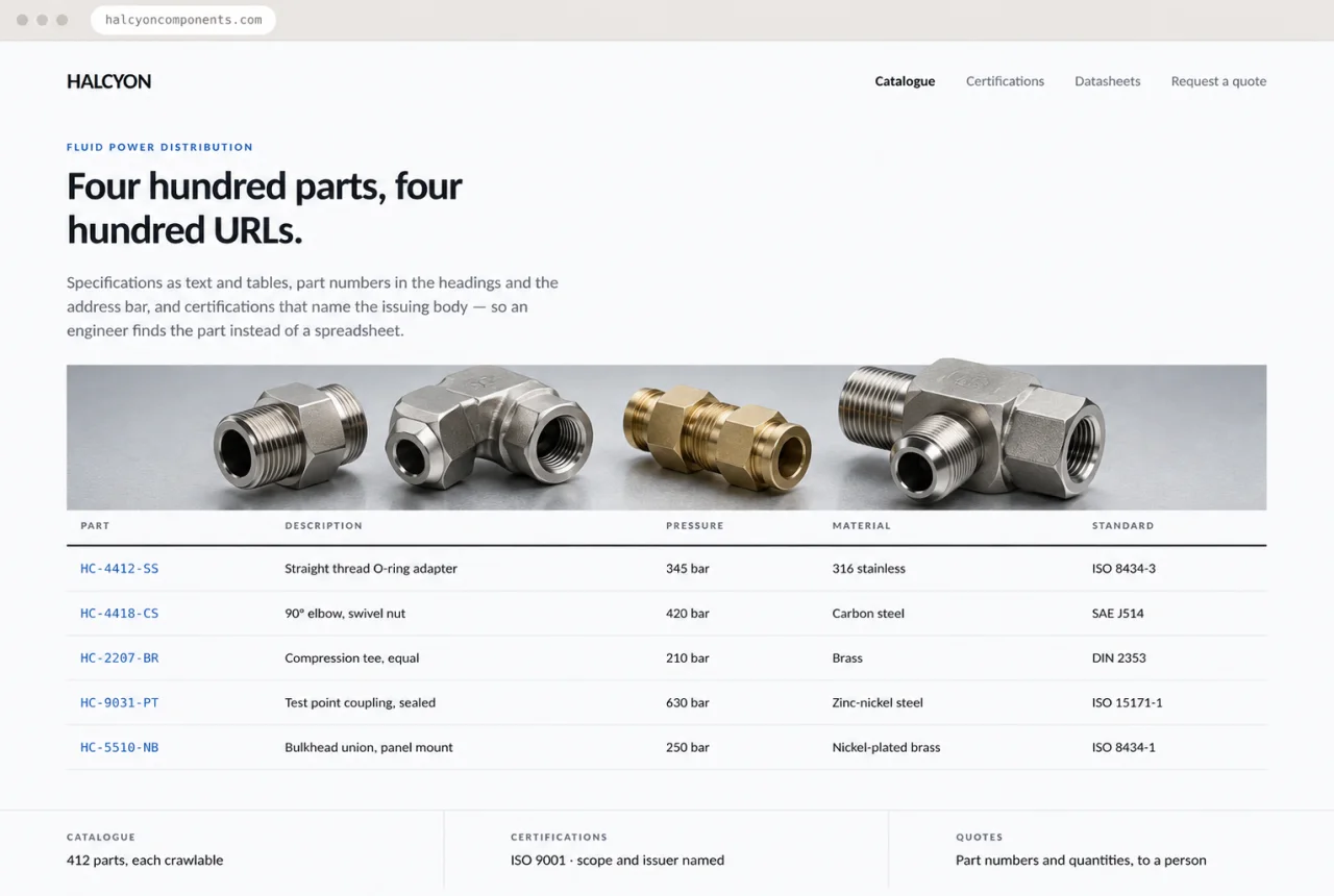
Design mockup of an industrial distributor website with machined fluid-power fittings, the headline “Four hundred parts, four hundred URLs”, and a specification table of part numbers and materials.
Hypothetical · B2B components distributor

A catalogue no system could read

Illustrative design mockup. Not a client site.

The situation. Four hundred parts distributed as a downloadable spreadsheet, a single contact form as the only route to a quote, and certifications shown as logo images with the issuing body and scope written nowhere. An engineer searching a part number found nothing at all.

What we built. Category and part pages generated from the distributor's own data, with specifications as text and tables and part numbers in the headings and the URLs. A certifications page naming each standard, issuer, scope and expiry, linked to the registries where each can be checked. A quote route that captures part numbers and quantities and reaches a person.

How we verified it. Every part number is reachable at a crawlable URL with its specifications as text. Certification claims name a verifiable issuer and scope. The spreadsheet is still downloadable — it is simply no longer the only way in.

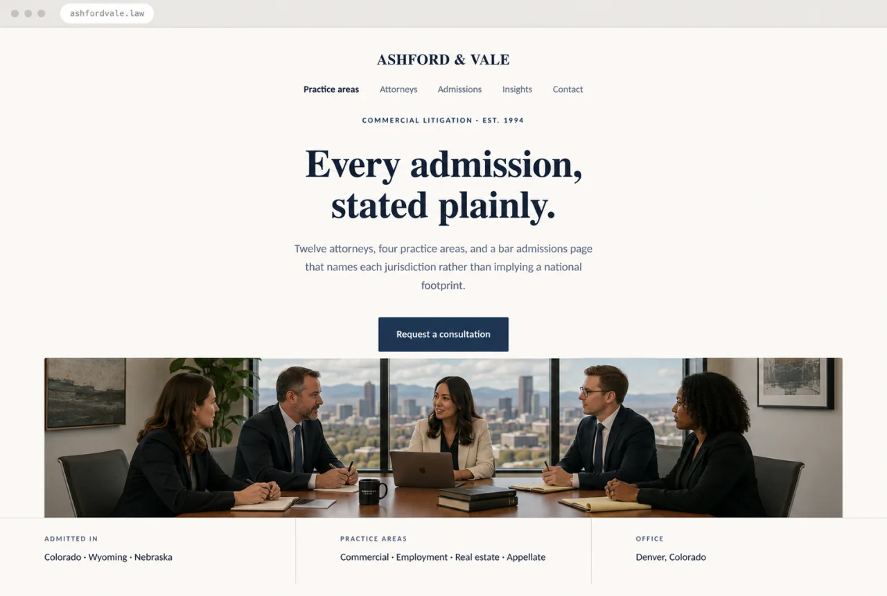
Design mockup of a law firm website with five attorneys meeting in a Denver office, the headline “Every admission, stated plainly”, and visible jurisdictions and practice areas.
Hypothetical · Litigation firm · twelve attorneys

A national footprint the firm did not have

Illustrative design mockup. Not a client site.

The situation. Marketing copy implied nationwide practice while the firm was admitted in three states. Attorney pages listed names and photographs but no bar admissions, no year of call, and no practice area. For a firm whose whole product is credibility, none of it was verifiable on the site.

What we built. An admissions page naming each jurisdiction and bar number. Attorney pages with year of admission, practice areas, reported matters and languages. Practice-area pages describing what the firm actually does in each, written by the partners who do it, replacing the borrowed copy.

How we verified it. Every jurisdictional claim on the site matches the bar records the firm supplied. Person structured data lists only credentials stated on the page. No claim of reach beyond the states named.

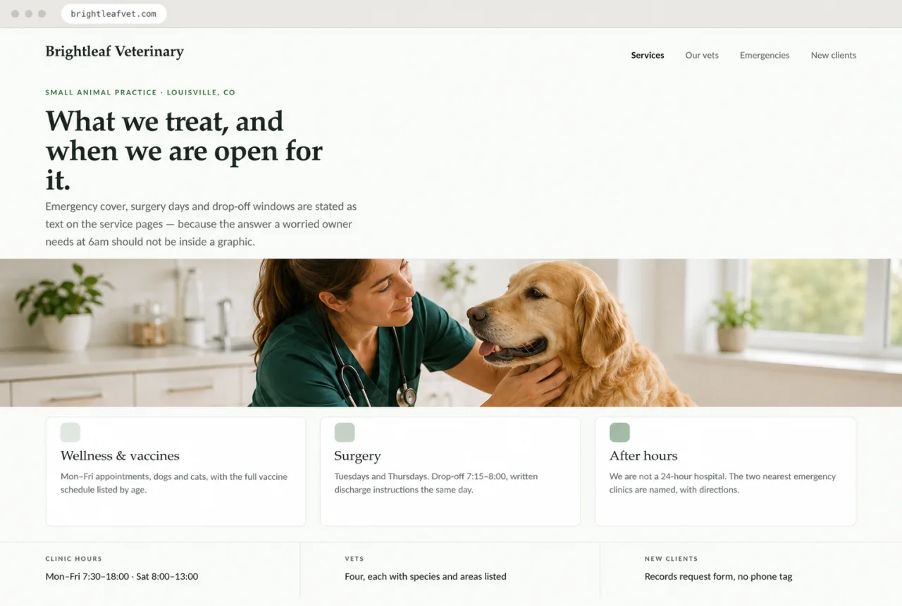
Design mockup of a veterinary website with a veterinarian examining a golden retriever, the headline “What we treat, and when we are open for it”, and visible service and clinic-hour details.
Hypothetical · Veterinary practice

The 6am question the site could not answer

Illustrative design mockup. Not a client site.

The situation. Emergency availability, surgery days and drop-off windows were spread across a graphic, a PDF new-client packet and a social post from the previous year. The practice is not a 24-hour hospital, but nothing on the site said so, and worried owners were arriving at a locked door at night.

What we built. Service pages stating what is treated and when, with surgery days and drop-off windows as text. An after-hours page saying plainly that the practice is not a 24-hour hospital and naming the two nearest emergency clinics with directions. A new-client route that requests records instead of starting a phone chain.

How we verified it. Hours and emergency status are text on the page, in the structured data, and on the map listing, in agreement. The after-hours page names real external clinics the practice confirmed and links to them.

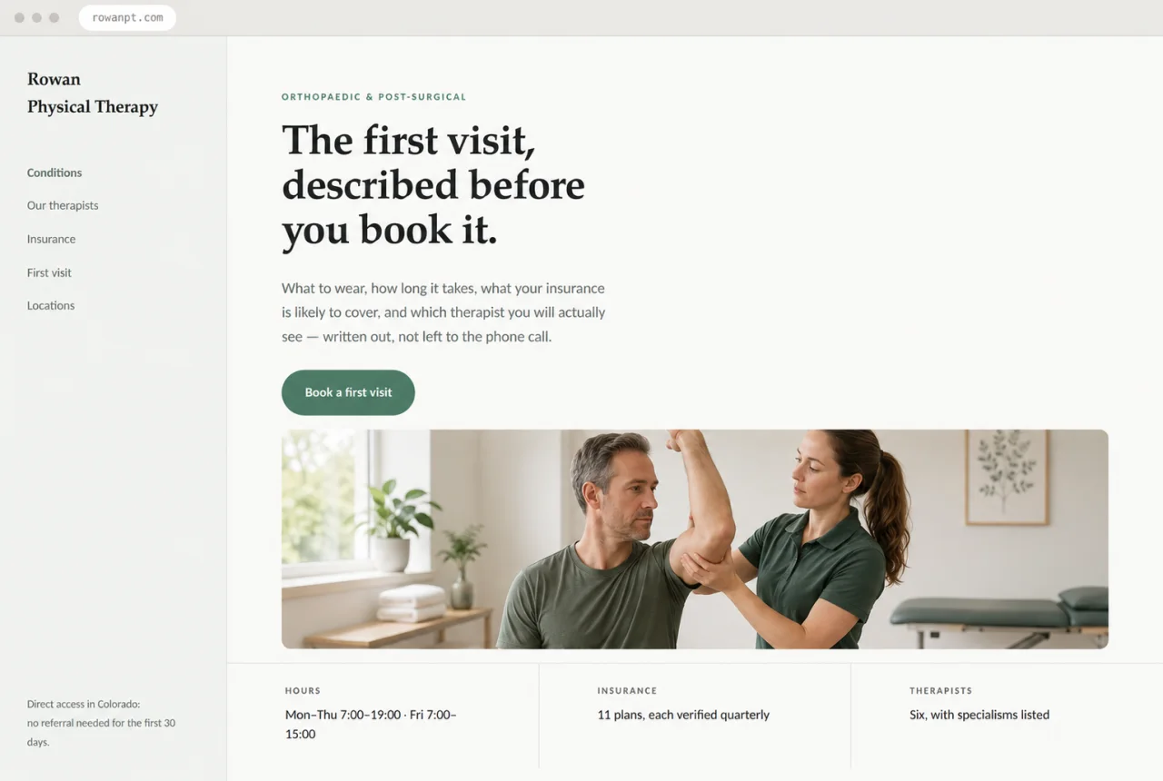
Design mockup of a physical therapy website with a therapist guiding a shoulder exercise, the headline “The first visit, described before you book it”, and visible hours and insurance details.
Hypothetical · Physical therapy · six therapists

Everything answered on the phone, nowhere on the site

Illustrative design mockup. Not a client site.

The situation. Every practical question — what to wear, how long a first visit takes, whether a referral is needed, which plans are accepted — was answered by the front desk, thirty times a day, because none of it was written anywhere. The site had four pages and a contact form.

What we built. A first-visit page answering each of those questions in order. An insurance page listing accepted plans with the date each was last verified. Condition pages describing what treatment actually involves. Therapist pages with specialisms, so a patient can ask for the right person by name.

How we verified it. Each answer on the site matches what the front desk says, confirmed by the practice manager line by line. Plan lists carry a verification date. Nothing about coverage is promised — the page says what is accepted and what to check.

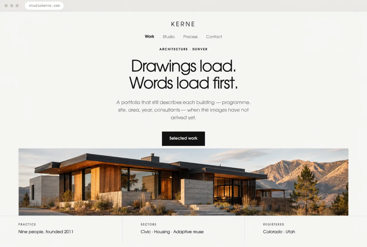
Design mockup of an architecture studio website with a contemporary timber and concrete Colorado house, the headline “Drawings load. Words load first.”, and visible practice details.
Hypothetical · Architecture studio

A portfolio that was only pictures

Illustrative design mockup. Not a client site.

The situation. An image-driven portfolio with almost no text: project names over full-bleed photographs, a single line of description, and no programme, site, area, year, client or consultant anywhere. Beautiful on a fast connection, and blank to anything reading the HTML.

What we built. A project record beneath every image set — programme, location, floor area, completion year, structural and services consultants, awards where they exist. A studio page with the practice's size, registrations and the way it works. The photography kept exactly as it was, now with words underneath it.

How we verified it. Every project remains fully described when images fail to load. Registration claims name the states the practice supplied. Page weight fell despite the added text, because the images were resized properly.

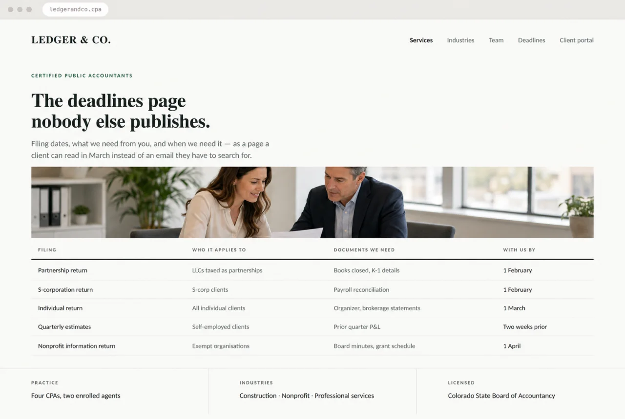
Design mockup of an accounting website with an accountant advising a business owner, the headline “The deadlines page nobody else publishes”, and a readable filing-deadlines table.
Hypothetical · Accounting firm

The deadlines everyone emailed about

Illustrative design mockup. Not a client site.

The situation. A four-page brochure site and a support inbox that answered the same seasonal questions hundreds of times: which filing applies to me, what do you need from me, and when. All of it existed — in the partners' heads and in last year's email threads.

What we built. A deadlines page as a real table: filing, who it applies to, the documents required, and the date the firm needs them. Service pages for each engagement type. An industries page describing the sectors the firm actually serves, and a licensing statement naming the state board.

How we verified it. The table is text, not an image or a PDF, and is reviewed by a partner each season. Dates on the page match the firm's internal calendar. No claim of registration the firm does not hold.

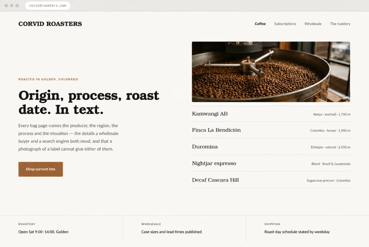
Design mockup of a coffee roaster website with freshly roasted beans in a cooling tray, the headline “Origin, process, roast date. In text.”, and a readable list of current coffee lots.
Hypothetical · Coffee roaster · retail and wholesale

Origin details that lived on the label

Illustrative design mockup. Not a client site.

The situation. Producer, region, process and elevation appeared only in a photograph of the bag. Wholesale buyers asked for a spec sheet by email every week, and the site could not answer the one question that decides a purchase: what is in the bag right now.

What we built. A page per lot naming the producer, region, altitude, process, varietal and roast profile as text, with the roast-day schedule stated by weekday. A wholesale page with case sizes and lead times. A subscription page that explains what arrives and when before asking for a card.

How we verified it. Lot details are text and change when the lot changes, from one source the roaster updates. Product structured data matches the visible page. Photography of the bags is still there — it is no longer carrying the information.

Standards

The checks every site passes before we call it finished.

These are pass-or-fail, not aspirations. If one fails, the site is not ready.

Content is readable without scripts

With JavaScript disabled, every page still shows its headings, body text, contact details, hours, and navigation. Scripts add convenience; they never hold the content hostage.

Facts are text, not pictures

No hours, phone numbers, addresses, prices, menus, or specifications rendered only inside an image or a PDF. Every one of them is selectable text in the HTML.

Business details agree everywhere

Name, address, email, service area, and hours are identical in the page text, the footer, the structured data, and — where we have access — the map and directory listings.

Structured data matches the page

Every schema.org property corresponds to something a visitor can see and the client has confirmed. No markup for claims that are not on the page. No invented ratings or reviews, ever.

Contact routes work on the first attempt

Phone and email are tappable links. The form validates, sends, and confirms. Nothing dead-ends. We test the form by sending through it and watching the message arrive.

One canonical URL per page

Clean URLs, correct canonical tags, a working sitemap and robots file, no duplicate paths, and redirects in place for anything that moved.

Accessible by default

Keyboard navigation throughout, visible focus states, meaningful alt text, real form labels, sensible heading order, and colour contrast that holds up in both light and dark settings.

Fast on an ordinary phone

Tested on a mid-range device over a normal connection, not on a laptop over office fibre. Images sized and compressed, fonts and scripts kept to what the page actually needs.

Want to know which of these your site fails?

Send your URL (or “no site”), your city, and what has to work at launch. We will tell you what we found.